Charts view
The charts view of the report screen shows a visual representation of the user's data. You can apply a filter(s) to hide some data and make graphs easier to read and understand. You can also add up to four metrics against which your data can be analyzed.
Figure 4. Charts view
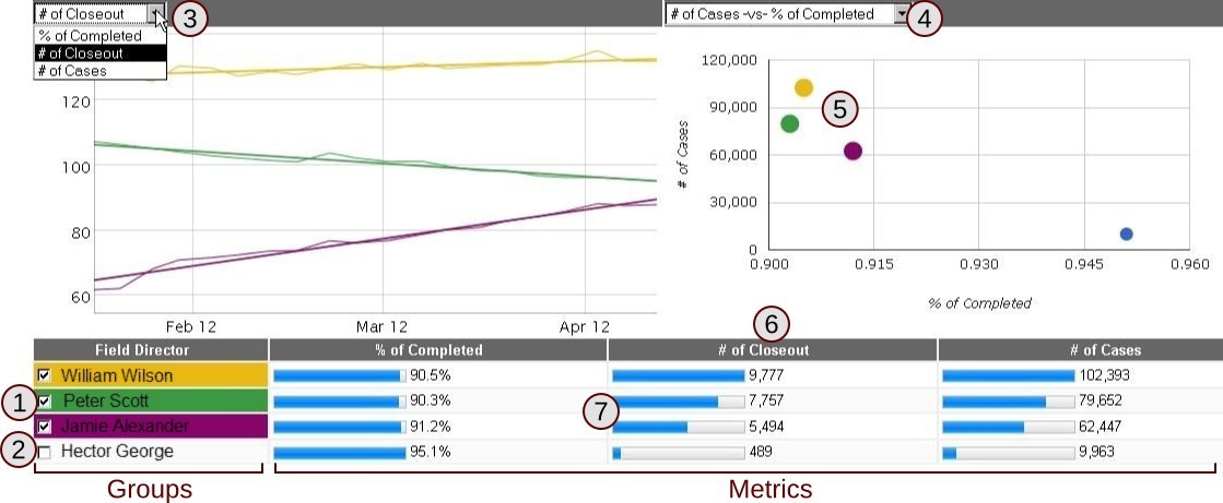
The charts section of the report view. (1) A selected group (2) An unslected group (3) Select metrics to be used to generate the trend chart (4) Select metrics to be used to generate the scatter plot chart (5) Color-coded selected groups (6) A metric column (7) Percent indicator for a metric
The bottom of the screen shows the current dataset after the date range and filters have been applied. You must have at least one group selected at any given time; the first column (or two columns if two groups are selected) will always be the currently selected group. In Figure 4, Field Director is the first assigned group. The rest of the columns represent the current metrics. See Groups and Metrics.
Tip
Adding more groups means creating more groups in the dataset display (#7 in Figure 4); adding more metrics will give you more axis options (#3 and #4).
To set what group will be displayed, click on the checkbox next to it. When a group is selected, it will be automatically assigned a unique color, which will be used to represent that group on the trend and scatter charts.
The trend chart displays two lines for each group; the jagged line represents actual data points, while the straight line show the trend of the actual data. As you move your mouse over the trend chart, you will see dots appear vertically on each of the lines. These dots represent data entries in your current dataset; more dots means that the data is higher resolution. You will also see the actual data displayed above the graph.
Figure 5. Trend chart
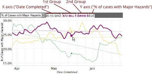
The trend chart, with the mouse hovering over an individual data point. The actual values and group names are displayed above the chart for the current data point.
The trend chart axises will automatically scale based on the current data that is displayed. You can zoom in on the data by clicking the mouse button and dragging horizontally or vertically. This will zoom in on your data, but not affect the data resolution. The X and Y axises will scale appropriately to the new zoom level. To return to the normal zoom level, double click the mouse button.
Figure 6. Zooming on the trend chart
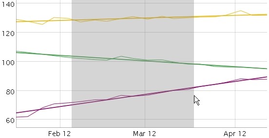
Zooming horizontally on the trend chart by clicking the mouse button and dragging horizontally. You can also zoom vertically.
The drop-down above the trend chart allows you to change the Y-axis of the chart; the X-axis will always by the date. The available options in this drop-down are determined by your current metrics. See Metrics.
The scatter point chart (Figure 7) shows all of your groups, both selected and unselected. Unselected groups will be displayed as a  , while selected groups are color-coded to match the table at the bottom of the screen. If you hover over a point, you will see the name of the group(s) for that dataset.
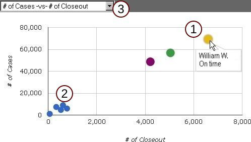
The drop-down menu above the scatter point chart is used to change the X and Y axises for the chart. The first metric listed is the Y-axis; the second metric is the X-axis.
Groups
Groups are used to separate data. For example, say that you have a set of 100 cases. If you set the first group to , your data will be separates and grouped by individual agents. If you select a second group, your data will be further separated. Table 1 shows how one dataset can be broken into smaller chunks by adding groups.
Note
Need an explanation of what a specific group is actually includes? Take a look at the Group and Metrics Reference Documentation.
Table 1. Group usage affect on data
| No groups | Agent | Agent & Status | ||
|---|---|---|---|---|
| 100 cases | Jane | 65 cases | Jane & completed | 34 cases |
| Jane & incomplete | 31 cases | |||
| John | 35 cases | John & completed | 25 cases | |
| John & incomplete | 10 cases | |||
The affect of group usage on a dataset.
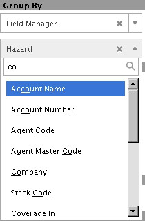
Combo boxes across the Management Reports use fuzzy string matching, meaning you'll find what you type, even if what you type is in the middle or at the end of a word. This is very useful if all you can remember is that the group you want is called the "something code."
A maximum of two groups may be used. Each dataset grouping can be represented on the trend chart and the scatter plot chart by activating it in the dataset display list at the bottom of the screen.
Metrics
Metrics are used to analyze datasets. The metric is always available by default; users can add up to four additional metrics.
Note
Need an explanation of what a specific metric actually measures? Take a look at the Group and Metrics Reference Documentation.
Figure 9. Metrics
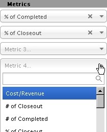
The metrics section of the sidebar, with two metrics added and the drop-down displayed.
Procedure 3. Adding a user defined metric
-
Click the box for the metric you want to add or modify from the sidebar.
-
Find the desired metric in the scroll list; you can filter the list by typing into the search box
-
Click the
 button for your metric to be added.
To remove a metric, click the  button on the right side of the metric, then click the button.
When you add a new metric, it will be available from the drop-down menu above the trend chart and scatter plot chart. For more information see Charts view.
Filters
Filters allow users to reduce the amount of visible data to find the information they want. For example, a filter can be used to only display cases within a given "coverage in" range. Only data that meets the criteria of all currently active filters will be displayed.
Tip
If you got the filters the way you like it, you can save your current settings as a new report. See Procedure 2.
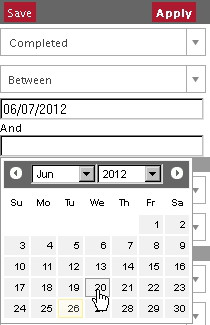
The date filter found at the top of the sidebar is one of the most common filters used. For some selections, you'll need to enter a range of dates (Figure 10).
Procedure 4. Using the date filter
-
Select the starting point for the filter (e.g. from the date ordered) from the first drop-down menu.
-
Select the time period to go back using the second drop-down menu.
-
Click the
button to make your filter take effect.
Tip
A report can contain thousands or tens of thousands of individual data points. Using the date filter can not only hide information you don't need but can also improve the management reports' performance.
All other filters are found under the Filters heading on the sidebar. All of these filters require the user to specify a value(s) or range. For example, if you select the "City" filter, a secondary menu will appear below it where you will need to select the city for your filter. You can also add filters that exclude specific data. This would be useful, for example, if you wanted to include all data from a specific county, but exclude data from a specific city in that county.
Figure 11. Filters
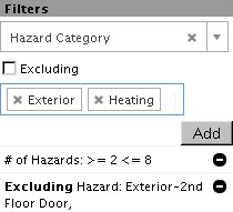
The filters; click within the box containing "Exterior" and "Heating" to add another value to this filter.
Procedure 5. Adding a new filter
-
Find the desired from the drop-down located in the filter section of the sidebar.
-
If the filter requires additional information, such a numerical range, enter that information now using the appropriate controls.
-
If you want the filter to exclude values from your report rather than include them, check
 .
.
-
-
Click the
 button
 -
Click the
button to make your filter take effect.
If the filter you are using requires you to select specific values (e.g. stack codes), you can select more than one value for the same filter. Click the blue box where your first value appears and the appropriate menu will be displayed again. To remove any values before adding the filter, click the button on the left side of the value.
To remove a filter after it has been added, click the  to the right of the filter. If you want to revise a filter after it has been added to a report, you'll need to remove it first, then the filter again.