Viewing a report
The Report Screen is where you can view the details of a report, add filters, create charts, and view raw data points. It is divided into two views: Charts and Grid. Charts allows you to view and manipulate high level data; the Grid gives you access to individual data sets and allows you to export data points for use in other software.
Figure 3. The Report Screen
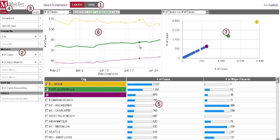
The Report Screen in charts view (1) Switch between Charts and Grid views (2) The sidebar (3) Apply filters button, grayed-out when there are no filters to apply (4) Save report button (5) Report data table (6) trend charts for currently selected report data (7) Scatter plot chart for all report data
Figure 3 shows the Report Screen in chart view. Click the  button to switch between the two views, or click the
  link to close the report and return to the dashboard. If you made any changes to it and you want to view those changes later, you'll need to save your report (Procedure 2).
At the bottom of the reports screen, you can view the groups of data. Click the column title bar to sort data by that column; click it again to reverse the order.
The blue bars in the data table represent the percentage of that data of the largest value in that column. For example, if there is a dataset with the number of cases and the highest data entry as 100 cases, an entry with 50 cases will have a blue bar that is 50% full. The largest value will always be displayed at 100%.
If you make changes to filters, metrics, groups, etc, you'll need to save your report for those changes to persist. See Procedure 2.

